During the browser wars, interesting problems presented themselves to the web design community. Many web professionals resorted to drastic measures and built separate websites for IE and Netscape — and later we had wireless markup language (WML) for mobile phones. This was because of inconsistent rendering and poorly implemented standards, and it was a means of avoiding the ugly hacking that was otherwise necessary.
This practice has evolved over the years (take print-friendly pages, for example), but the modern web almost shuns the practice entirely.
Web standards are being developed and adopted at a rapid pace (especially as older browsers retire) but the dawn of a new device-friendly era in which mobile phones, cars, televisions and household appliances can access the web has resulted in an uncontrollable situation.
As a web designer, I’m always on the lookout for good solutions, and as strange as it may sound, the case for having separate, situational websites to deal with different devices is getting stronger by the day.
Here’s why.
Problems with Singular Solutions
The initial problem that forced us to adopt a one-size-fits-all model was discrimination. During the browser wars, our main complaint was that deliberate actions by browser makers to gain dominance ended up hurting web standards. Even the humble print-only page was an act of "discrimination"; it drew users away from the standard "Print" button in browsers.
Every case of separation led to some kind of web design anxiety, which made life extra hard.
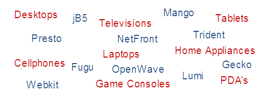 We no longer have two devices and five renderers; now it’s hundreds of devices and 20+ renderers!
A single website for every situation: what a wonderful concept. Such a website would be easier to maintain (unless the other designs are automatically generated), and they would cut down on domain confusion by doing away with forced URL redirects and not burdening users with having to remember the top-level domain (TLD) for their specific version.
If browsers and devices rendered things equally well and treated our wonderful layoutsas they were intended, we could continue to rely on one-for-all websites.
But things are no longer that simple.
Years ago, we worried only about screen resolutions, web-safe typography and whether browsers could handle our code.
Now, we deal with a range of unit measurements that boggle the mind. How big is the screen? Does it support zooming? What input hardware is available? How fast can it render? Do users have bandwidth limits? How can one layout be fluid enough to deal with it all?
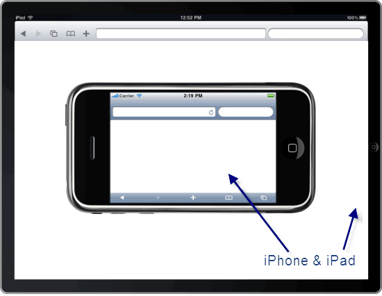 Don’t confuse the iPhone and the iPad; there are two different screen sizes to design for!
With single page websites, it isn’t so much about the visuals that our users have to settle for (though usability is important); it’s about the measure of the background processes involved, and about making our pages as agile as possible for a platform’s needs (while taking advantage of its hardware).
We talk a lot about optimizing our web designs for usability, user experience, and front-end performance, so (putting aside time constraints for the moment) why would we give users a "second-hand" layout — built for one platform and then hacked into a new shape for another?
We Need Dynamic Designs
The Wireless Markup Language (WML) is a depreciated language, but I have to admit that web designers could learn a lot from the short-lived benefits that it brought to the table. It forced us to create a separate layout and structure for mobile phones — which were the only alternative devices, apart from the unpopular WebTV product that MSN put out in the ’90s.
The new layouts brought new advantages. Most pages were small and agile, and they were guaranteed to work on mobile devices. Plus, we weren’t left with countless "what if" questions.
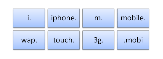
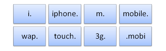 Many designers recognize the appeal of being platform-specific, so TLD conventions for them now exist.
Standards have evolved, naturally, but the need for dynamic, situational websites that cater to certain device types is evident. Bandwidth and speed are major issues on mobile platforms, and support for technologies that address those issues could change the game. Too many designers look at the mobile web simply as "the desktop, but smaller" — and that is a fatal mistake.
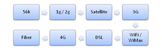 Your visitors could be using one of a number of connection types that affect speed.
The problems we face now result from the mysterious issue of device diversity.Following the principles of progressive enhancement would curtail the quirks of designing for certain devices, but they wouldn’t help with the redundancy of adapting desktop websites to a mobile platform.
It’s not just a matter of having separate websites for each device; it’s about creating one version for all web-enabled platforms and using the available tools to enhance the experience on each.
As it currently stands, the major platforms include:
- Desktops (including notebooks, netbooks and traditional computers)
- Mobile devices (not just mobile phones, but tablets and other touch devices)
- Televisions (both web-enabled TVs and game consoles on large displays)
- Appliances (don’t forget those quirky devices that don’t fit in other categories, like refrigerators)
The number of people using each of these platforms is increasing, and although the numbers are difficult to crunch, it stands to reason that we should design only as our audience calls for it.
If you’re building a mobile website, why not tear it away from the desktop and gain the benefit of a clean surface to work with — and, more importantly, the opportunity to adapt your content to the platform? If your visitors want the mobile experience, they can choose it; leave the full desktop website untarnished and accessible to others.
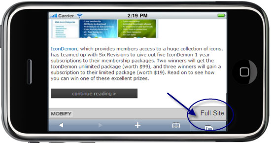 Allowing users to revert to the desktop experience is important. Don’t forget it!
The Benefits of Separating Structure
Apart from offering two ways to browse, what are the main reasons to build separate websites rather than make a desktop design "mobile-friendly"?
The primary benefit is greater compatibility. With a desktop "conversion," one relies entirely on browser detection to ensure that the right design is being served. Instead, make a generic mobile layout that can work on all devices of that type but that can still be customized for specific platforms. There are plenty of tools for testing your mobile layout on various devices.
Let me justify separate, situational web designs:
- Even unknown mobile devices will be able to access the mobile experience instead of the desktop one.
- Maintaining "themes" for particular devices (i.e. styling the mobile structure) is easier.
- Users can quickly and easily switch between designs, with no extra scripting.
- You can identify key markets (phones, TVs, etc.) and design unique layouts for them.
- Screen real estate will not be wasted on clutter that forces users to zoom around.
A separate website could have a standardized mobile theme and be further enhanced with feature detection, perhaps for iOS or Android. Of course, this is also possible with a normal layout. The unfortunate side effect of detection is that website overhead increases. Rather than designing for smart phones and focusing on a couple of models for custom styling, we instead have to account for the hundreds of thousands of variations. It’s a scary thought.
 Remember that old devices deserve as much respect as advanced platforms.
The benefits of separate website designs can also be seen in code. By offering options to your visitors, you’ll avoid the need for feature detection (unless you want to auto-forward them). Keep your desktop website clear of mobile code and the mobile website free of desktop code; this is crucial. It may not seem significant, but redundancy on the mobile web is a serious issue that desktop websites can’t solve alone.
Here are some more reasons:
- Users only have to download the code that is useful for their device type.
- The overhead for detection scripts is greatly reduced to just special cases (if any).
- You can craft an alternative experience that takes advantage of hardware requirements.
- Printers have browser support, but device capabilities require feature detection.
- You save time with less CSS and JavaScript or having an alternative WML structure.
Content Design Optimization
Of course, the biggest justification for separate web designs — and it goes against the current trend — is content, and the opportunity to tailor it to individual platforms.
If your website is for mobile phones, you know that screen sizes will be small and, as such, images and video should be scaled down to match (which will save loads on bandwidth).
Content can be reduced in density, too (to reduce heavy scrolling), and longer documents can be broken down and served in more digestible chunks.
 Scrolling a mile of content is no fun, so consider breaking it into small clusters.
If you still need reasons, here are a few more:
- Lengthy content may not adapt well from one layout to another.
- You can treat media-capable platforms different to text-only devices.
- Images and media can be scaled up or down to match screen size (saving bandwidth).
- Connectivity issues can be addressed (such as by displaying content on demand on one-page websites).
- You can serve relevant content, discard the rest and reduce costly interactions more easily.
The Web’s Wild West
Providing a device-oriented experience ensures that dissonance with interfaces is as low as possible. Still, there will be occasions when a separate website is not needed. Whatever your decision about building separate websites, your visitors’ needs should be the guiding factor.
Complex websites with multiple columns, lengthy scrolling, large file sizes and a lot of images and media are ideal for separate websites in most cases.
A simply designed or single-page website might not benefit much from dynamic, situational behavior. Often, you’ll want to drain away excess material, to be left with a design that merely requires some optimization. If you’re producing something complex, like a web app or an elegant use-every-inch-of-the-screen layout, that’s obviously another matter; but simplicity is diversity’s best friend.
 Automated tools like Mobify help, but they don’t optimize content — which is 90% of the website.
Situational web design isn’t just about seeing the web in a new light: it’s about recognizing that the diversity of ways of interacting with the web need to be addressed. Designers put so much effort into building desktop websites that it becomes second nature to think that variations should match the original design as much as possible. In the ’90s, we realized that serving the exact same layout to two browsers (and have it be optimal and usable) isn’t possible; the same is now true with the device revolution.
Examine your website and how it interacts with different devices. Perhaps you could reduce data usage by employing device-oriented graphics (based on screen size). Maybe you could serve less content per page for small screens, or more content for large one. Whatever you do, design for each platform independently. Design around the content in order to give users on a particular device the opportunity to enjoy it.
There is no longer just one web to design for; let’s make the best of it!